Edit the transition and submission button
Customize the transition and submission button that appears at the bottom of all screens.
The transition and submission button appears at the bottom of every screen, even the last screen in an activity. Because participants can change their responses before proceeding to the next screen, they must tap or click this button to submit their selections.
-
In the
Transition & Submission Button area,
select a button option.
Button options include:
- Static rectangular button with text.
- Static arrow button with text.
- "Swipe up" animated arrow with no text.

- If you selected a static button with text, in the preview pane, type the button text.
- In the preview pane, click the button to open the inline editor.
-
Use the formatting options in the inline editor to customize the
appearance of the button and text.

Formatting option Description Font
 Click the arrow on the right side and select a font from the menu. Options include:
- Abril Fatface
- Comfortaa
- Courier Prime
- Dosis
- Lato
- Roboto
- Sacramento
- Times New Roman
Font size
 Click the arrow on the right side and select a font size from the menu. Options include:
- 8
- 12
- 16
- 24
- 32
- 40
- 48
- 56
- 64
Bold

Click this button to apply or clear bold formatting.
Italic

Click this button to apply or clear italics.
Underline

Click this button to apply or clear underlining.
Button alignment
 Click the arrow on the right side and select an alignment option. Options include:
- Left align
- Right align
- Center
Text color

Click this button to select a new text color.

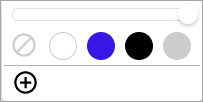
- Use one of the preset colors (white, purple, black, or grey).
- Use the slider above to adjust opacity.
- Click the plus sign button
to choose a custom color. This opens the custom color picker.

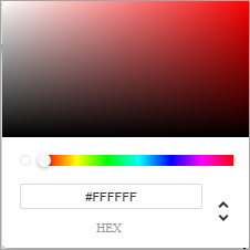
- Click anywhere inside the ombre rectangle to select a shade.
- Use the slider to select a different color.
- Use the up and down
arrow buttons to toggle between different options for specifying a color by
code. Options include:
- HEX
- RGBA
- HSLA
- The custom colors you use
are automatically saved. The first 20 custom colors are displayed. If more than
20 custom colors are used, the twenty-first color will replace the oldest
color.

Button color

Click this button to select a new button color.

- Use one of the preset colors (white, purple, black, or grey).
- Use the slider above to adjust opacity.
- Click the plus sign button
to choose a custom color. This opens the custom color picker.

- Click anywhere inside the ombre rectangle to select a shade.
- Use the slider to select a different color.
- Use the up and down
arrow buttons to toggle between different options for specifying a color by
code. Options include:
- HEX
- RGBA
- HSLA
- The custom colors you use
are automatically saved. The first 20 custom colors are displayed. If more than
20 custom colors are used, the twenty-first color will replace the oldest
color.

Button size

If you selected a rectangular button with text, click this button to select a button size option. Options include:
- Short (109 pixels width, 40 pixels height)
- Medium (218 pixels width, 40 pixels height)
- Long (327 pixels width, 40 pixels height)
The default button size is long.