 Display in your app
Share your Touchpoint activity within a mobile app.
-
On the
Appearance & Behavior tab, select a
presentation option.
To see what these presentation options look like, see In-app Touchpoint activities.
Option Description Pop-up
A pop-up displays the specified activity when the respondent lands on the specified screen. The activity fills the entire view port and becomes the focal point for your respondent.
If you select this option, you must also choose where this activity will appear. Options include:
- On all screens of the app
- On the
screen(s) I specify
If you choose this option, in the Select screen(s) list, select one or more screens.
Then, choose when the activity will display. Options include:
- Immediately after a respondents navigates to the screen (s) with assigned activities
- After a
delay
If you choose this option, set the delay in seconds.
Custom Component
This option is available only if the mobile app has custom components configured.
Custom components are UI components built by mobile app developers and maintained in your own mobile app codebase. Clicking on or otherwise invoking these components will open a Touchpoint activity inside of a webview.
If you select this option, you must also select the screen where this activity will appear, and the custom component that will trigger the activity to be displayed. Click Add Screen to add another screen and custom component that will trigger the same activity.
Banner
Banners are out-of-the-box UI components that the SDK can render at any time, on any screen you specify, without the need for code changes to the mobile app. When participants tap a banner, a Touchpoint activity opens inside a webview. Because banners are out-of-the-box, there is limited design flexibility.
If you select this option, you must also choose where this activity will appear. Options include:
- On all screens of the app
- On the
screen(s) I specify
If you choose this option, in the Select screen(s) list, select one or more screens.
Type the Display Text that will appear in the banner.
Then, set the text color and banner color.

-
Choose who will see the activity.
- All Visitors
-
Visitors with specific attributes
If you choose this option, select the attribute name and then set the condition operator and values. Click Add Attribute to add another attribute statement, or click the delete button beside the statement to delete it. The attribute statements have an "and" relationship; visitors must meet all conditions to see the activity.
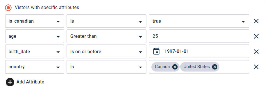
The condition operators and values vary depending on the data type of the attribute.
Attribute data type Condition operators Values Boolean - Is
- Is not
Select one of these values: - true
- false
Date - Is
- Is not
- Is after
- Is before
- Is on or after
- Is on or before
Click the calendar button to open the date picker and select a date.

In calendar view, use the left and right arrows to scroll through the calendar a month at a time.
Alternately, type a date (yyyy-mm-dd).
Number - Is
- Is not
- Greater than
- Greater than or equal to
- Less than
- Less than or equal to
Type a number.
String - Is
- Is not
- Contains
- Does not contain
- Ends with
- Starts with
Type the string values and press Enter after each one. To remove a value, click the x beside it.
Multiple string values have an "or" relationship. Visitors must have one of the values. For example, in the screenshot above, the visitor must have a country value of "Canada" or "United States."
The string value must be an exact match for the value that is passed to the website. For example, if you type United States but the value that is passed is USA, the attribute statement will not work.
For more information, see Targeting with visitor attributes.