Touchpoint custom activity themes
Use custom themes to apply styling to an activity quickly. Custom themes can increase authoring efficiency, and keep branding and appearance consistent across screens.
Create a custom theme
Edit a custom theme
-
Click
Edit Theme to make theming element
selections.
When you are finished, in the theme editor panel:
- Click Apply edits to apply your changes.
- Click Discard changes to discard your changes from this session.
- Click
Reset theme to Default to restore the
default theme.

-
Toggle between mobile, tablet, and desktop view to preview your
changes.

Select a theme for your activity
-
In the Activity Builder, on the toolbar, click
Activity Settings.

Theming elements
Outer Background
| Formatting option | Description |
|---|---|
|
Background image 
|
|
|
Background color 
|
|

Inner Background
| Formatting option | Description |
|---|---|
|
Background color
|
|
Text Box
| Formatting option | Description |
|---|---|
|
Font 
|
Click the arrow on the right side and select a font
from the menu. Options include:
|
|
Font size 
|
Click the arrow on the right side and select
a font size from the menu. Options include:
|
|
Bold 
|
Click this button to apply or clear bold formatting. |
|
Italic 
|
Click this button to apply or clear italics. |
|
Underline 
|
Click this button to apply or clear underlining. |
|
Align 
|
Click the arrow on the right side and select an
alignment option. Options include:
|
|
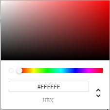
Text color 
|
|
|
Text box background color 
|
|
Title Text
| Formatting option | Description |
|---|---|
|
Font
|
Click the arrow on the right side and select a font
from the menu. Options include:
|
|
Font size
|
Click the arrow on the right side and select
a font size from the menu. Options include:
|
|
Bold
|
Click this button to apply or clear bold formatting. |
|
Italic
|
Click this button to apply or clear italics. |
|
Underline
|
Click this button to apply or clear underlining. |
|
Align
|
Click the arrow on the right side and select an
alignment option. Options include:
|
|
Text color
|
|
|
Text background color
|
|
Subtitle Text
| Formatting option | Description |
|---|---|
|
Font
|
Click the arrow on the right side and select a font
from the menu. Options include:
|
|
Font size
|
Click the arrow on the right side and select
a font size from the menu. Options include:
|
|
Bold
|
Click this button to apply or clear bold formatting. |
|
Italic
|
Click this button to apply or clear italics. |
|
Underline
|
Click this button to apply or clear underlining. |
|
Align
|
Click the arrow on the right side and select an
alignment option. Options include:
|
|
Text color
|
|
|
Text background color
|
|
Prompt Text
| Formatting option | Description |
|---|---|
|
Font
|
Click the arrow on the right side and select a font
from the menu. Options include:
|
|
Font size
|
Click the arrow on the right side and select
a font size from the menu. Options include:
|
|
Bold
|
Click this button to apply or clear bold formatting. |
|
Italic
|
Click this button to apply or clear italics. |
|
Underline
|
Click this button to apply or clear underlining. |
|
Align
|
Click the arrow on the right side and select an
alignment option. Options include:
|
|
Text color
|
|
|
Text background color
|
|
Logo
| Formatting option | Description |
|---|---|
|
Logo image |
|
Choice Question Text
| Formatting option | Description |
|---|---|
|
Font
|
Click the arrow on the right side and select a font
from the menu. Options include:
|
|
Font size
|
Click the arrow on the right side and select
a font size from the menu. Options include:
|
|
Bold
|
Click this button to apply or clear bold formatting. |
|
Italic
|
Click this button to apply or clear italics. |
|
Underline
|
Click this button to apply or clear underlining. |
|
Align
|
Click the arrow on the right side and select an
alignment option. Options include:
|
|
Text color
|
|
Choice Question Display
| Formatting option | Description |
|---|---|
|
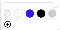
Answer option color
|
|
|
Answer option shape 
|
Click the button to select a shape for answer
options. Options include:
|
|
Radio button shape 
|
If you select radio buttons as your answer
option shape, you can set the shape of the radio buttons themselves. Options
include:
|
|
Answer option padding 
|
Click the button and use the notched slider to adjust the padding along the top and bottom of answer options. Your selection snaps to the nearest notch in the slider. The leftmost notch represents almost no padding, while the rightmost notch represents the maximum amount of padding possible. |
|
Answer option spacing 
|
Click the button and use the notched slider to adjust the amount of space between answer options. Your selection snaps to the nearest notch in the slider. The leftmost notch represents the least amount of space between answer options, while the rightmost notch represents the most amount. |
Numeric Scale
| Formatting option | Description |
|---|---|
|
Scale button shape 
|
Select a shape for the scale buttons:
|
|
Primary color Secondary color 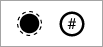
|
The primary color controls the color of the inner circles, and the color of the dotted outline around the selected number. The secondary color controls the color of the numbers, and the solid outline around unselected numbers. 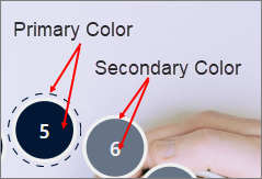
|
| Formatting option | Description |
|---|---|
|
Font
|
Click the arrow on the right side and select a font
from the menu. Options include:
|
|
Font size
|
Click the arrow on the right side and select
a font size from the menu. Options include:
|
|
Bold
|
Click this button to apply or clear bold formatting. |
|
Italic
|
Click this button to apply or clear italics. |
|
Underline
|
Click this button to apply or clear underlining. |
|
Align
|
Click the arrow on the right side and select an
alignment option. Options include:
|
|
Text color
|
|
|
Text background color
|
|
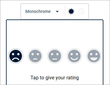
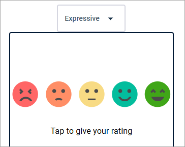
Reaction Scale
| Formatting option | Description |
|---|---|
|
Face 
|
|
|
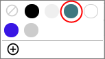
Face fill color Outline color
|
Applies to Monochrome faces only. The face fill color determines the color of the faces. The outline color determines the color of the faces' outlines and expressions. 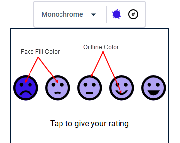
|
Date Entry
Date Input
| Formatting option | Description |
|---|---|
|
Font
|
Click the arrow on the right side and select a font
from the menu. Options include:
|
|
Bold
|
Click this button to apply or clear bold formatting. |
|
Italic
|
Click this button to apply or clear italics. |
|
Underline
|
Click this button to apply or clear underlining. |
|
Font color
|
|
Date Input Display
| Formatting option | Description |
|---|---|
|
Font
|
Click the arrow on the right side and select a font
from the menu. Options include:
|
|
Font size
|
Click the arrow on the right side and select
a font size from the menu. Options include:
|
|
Bold
|
Click this button to apply or clear bold formatting. |
|
Italic
|
Click this button to apply or clear italics. |
|
Underline
|
Click this button to apply or clear underlining. |
|
Align
|
Click the arrow on the right side and select an
alignment option. Options include:
|
|
Text color
|
|
|
Text background color
|
|
Button
| Formatting option | Description |
|---|---|
|
Transition and submission button style 
|
Select a transition and submission button style. Options include:
|
|
Font
|
Click the arrow on the right side and select a font
from the menu. Options include:
|
|
Font size
|
Click the arrow on the right side and select
a font size from the menu. Options include:
|
|
Bold
|
Click this button to apply or clear bold formatting. |
|
Italic
|
Click this button to apply or clear italics. |
|
Underline
|
Click this button to apply or clear underlining. |
|
Button alignment 
|
Click the arrow on the right side and select an
alignment option. Options include:
|
|
Text color
|
|
|
Text background color
|
|
|
Button size 
|
If you selected a rectangular button with text, click this button to select a button size option. Options include:
The default button size is long. |
|
Button corners 
|
If you selected a rectangular button with text, click this button to adjust how rounded the corners of the button appear. Drag the slider to one of the notches. 
The leftmost side of the slider represents sharp, rectangular corners with no roundedness. 
The rightmost side of the slider represents the maximum level of roundedness and gives the button a pill shape. 
|
Progress Bar
| Formatting option | Description |
|---|---|
|
Progress bar color
|
|