 Create a Reaction
Scale
Ask participants to select a response from a happy-to-sad face range.
To make a Reaction Scale screen as engaging and visually appealing as possible, try:
- Keeping question text concise.
- Using a background image.
- Selecting high-contrast text and button colors.
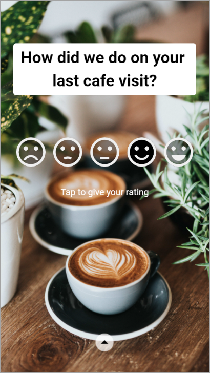
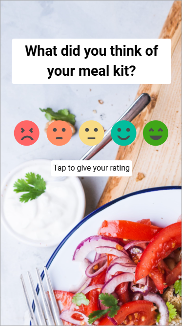
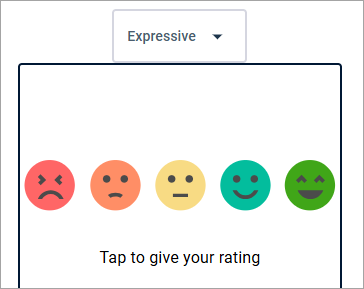
- Using colorful, expressive faces instead of monochrome ones.
Monochrome
Expressive
- On the Dashboard or the Activities page, click the activity name, and then click Build.
-
Click
Add Screen and select
Reaction Scale.
Result: A new Reaction Scale screen appears in the Activity Content area.
- Optional:
Edit the screen name.
In the Activity Content area, click the edit button on the right and type a new name. This name is not visible to participants.

-
Select or clear
Screen Rules.
Option Description Auto Advance to Next Screen When this option is selected:
- Participants automatically advance to the next screen after they provide an answer. They do not have to click a transition or submission button.
- Share Back Results is not possible. You must deselect Share Back Results in order to select Auto Advance to Next Screen.
- Make Response Optional is not possible. Participants must provide an answer to proceed.
- You cannot turn on the Multiple Choice toggle.
- You do not have to edit the transition and submission button.
Make Response Optional By default, question screens require a response. Select this option to allow participants to proceed to the next screen without answering.
You can also select or clear Show Skip.
- When selected, a Skip Question control appears separately from the transition and submission button. Participants can click Skip Question to skip the question, or they can answer the question and then click the transition and submission button.
- When cleared, only the transition and submission button appears. Participants click the transition and submission button to either skip the question or proceed.
Tip: Customize the Skip Question control's text and appearance by clicking it in the preview pane. -
Set the respondent
journey.
This step is required for any screen that is not the last screen in the Activity Content area. You should also preview the respondent journey to ensure there are no errors.
- Type the question and format the question text.
-
Edit the face scale.
-
In the preview pane, hover over the face scale until a dotted
outline appears around the face scale area, and then click inside the dotted
outline.
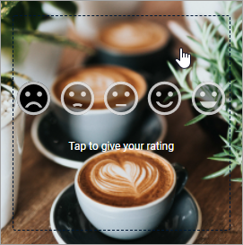 Result: The face scale edit toolbar appears.
-
Select a face option.
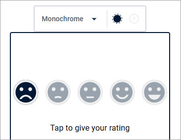
- Monochrome
gives you a range of faces from sad to happy. The faces can have two colors, a
fill color and an outline color.
- Expressive
gives you a livelier range of facial expressions. The face colors are preset to
a rainbow (red, orange, yellow, teal, green), and cannot be changed.
- Monochrome
gives you a range of faces from sad to happy. The faces can have two colors, a
fill color and an outline color.
-
If you chose
Monochrome, select a fill color and an
outline color for the faces.
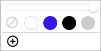
- Use one of the preset colors (white, purple, black, or grey).
- Use the slider above to adjust opacity.
- Click the plus sign button
to choose a custom color. This opens the custom color picker.
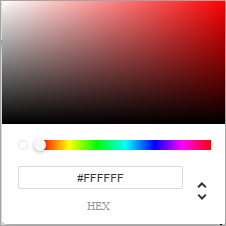
- Click anywhere inside the ombre rectangle to select a shade.
- Use the slider to select a different color.
- Use the up and down
arrow buttons to toggle between different options for specifying a color by
code. Options include:
- HEX
- RGBA
- HSLA
- The custom colors you use
are automatically saved. The first 20 custom colors are displayed. If more than
20 custom colors are used, the twenty-first color will replace the oldest
color.

-
In the preview pane, hover over the face scale until a dotted
outline appears around the face scale area, and then click inside the dotted
outline.
-
Add an image as a
background.
Tip:
- You can use the Image Editor to make quick adjustments to background images.
- If you want a solid background, you can set a background color instead.
- For multilingual activities, add text translations.
- Edit the transition and submission button.
- Optional: Select or clear Treat the response as sensitive data.
-
To preview the activity while still building it, on the activity
toolbar, click
Preview.

The preview opens in a new browser tab. Select a device type to simulate a screen size. Device type options include:
- Phone
- Tablet
- Desktop
For multilingual activities, you can also select the preview language from the language menu.
Previewing the activity throughout the building process gives you a rough idea of how questions will display across different screen sizes, and lets you test the overall activity flow. However, the activity's appearance may vary on different devices and mobile browsers. Testing on a real device before publishing and distributing the activity is highly recommended.
- On the activity toolbar, click Save.